I was browsing around david robinson’s tidytuesday posts, and found the one on superbowl ads and decided to do it with pandas. Checkout the R notebook here. I enjoyed the analysis and learned couple of new cool pandas tricks. hope you enjoy! Also here’s the jupyter notebook:
ads = pd.read_csv("https://raw.githubusercontent.com/rfordatascience/tidytuesday/master/data/2021/2021-03-02/youtube.csv")
Count of ads over the years
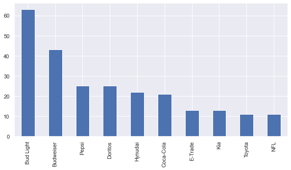
Let’s start by looking into ads total count of each brand.
ads.brand.value_counts().plot(kind="bar",figsize=(10,5))
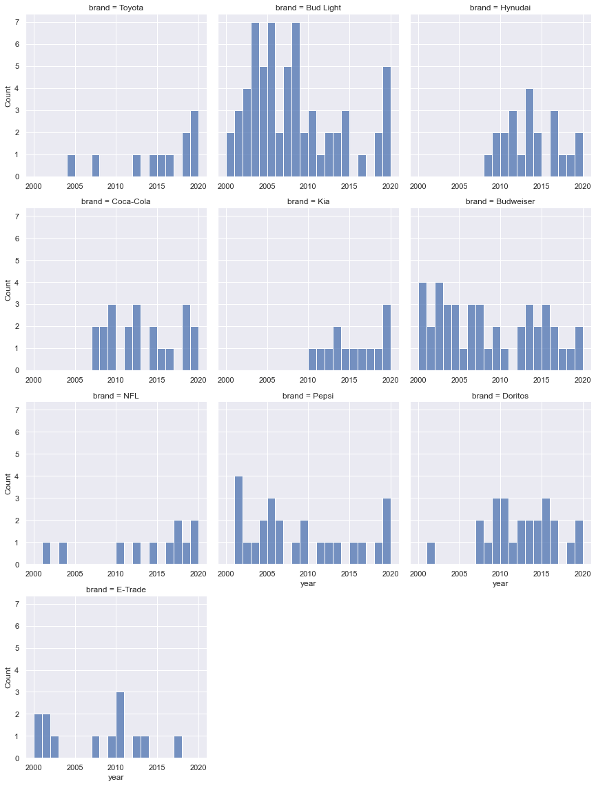
I want to see the histogram of ads over the years, for each brand. the BudLight one looks interesting. I wonder if it has something to do with pushing hard on like a brand awareness type budget(compared to Doritos for example). I googled “how much did bud light spend on super bowl commercials?” and here’s the answer: “Between 2016 and 2020, Bud Light has spent $61.4 million on Super Bowl airtime”
This one’s pretty awesome: https://www.youtube.com/watch?v=g6CVKs77X74
g = sns.FacetGrid(ads,col="brand", height=4, col_wrap=3, aspect=1)
g.map_dataframe(sns.histplot, "year",binwidth=1)
g.set_axis_labels("year", "Count")

for ax in g.axes.flatten():
    ax.tick_params(labelbottom=True)
Distribution of view, like, dislike, comment
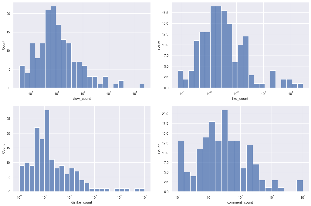
Now let’s look into the histogram of [“view_count”,”like_count”,”dislike_count”,”comment_count”]. this helps us get a sense of the order and distribution of numbers. It’s interesting how like_count has a normal dist look to it, but disklike is heavily skewed to the left. an oversimplified explanation for this might be that there might be a group of dislikers, and disliking behaviour is assigned to them not the whole population. while that’s not the case with liking a post, which is the easiest and most common way of engaging with a post.
metric_counts = ads[["view_count","like_count","dislike_count","comment_count"]]
metric_counts = metric_counts[((metric_counts>0).all(axis=1))]

fig , axes = plt.subplots(2,2,figsize=(15,10))
fig.tight_layout(pad=3.0)

for i,ax in enumerate(axes.reshape(-1)):
    col = metric_counts.columns[i]
    ax.set_xscale('log')
    sns.histplot(data=metric_counts, x=col,binwidth=0.2,ax=ax)
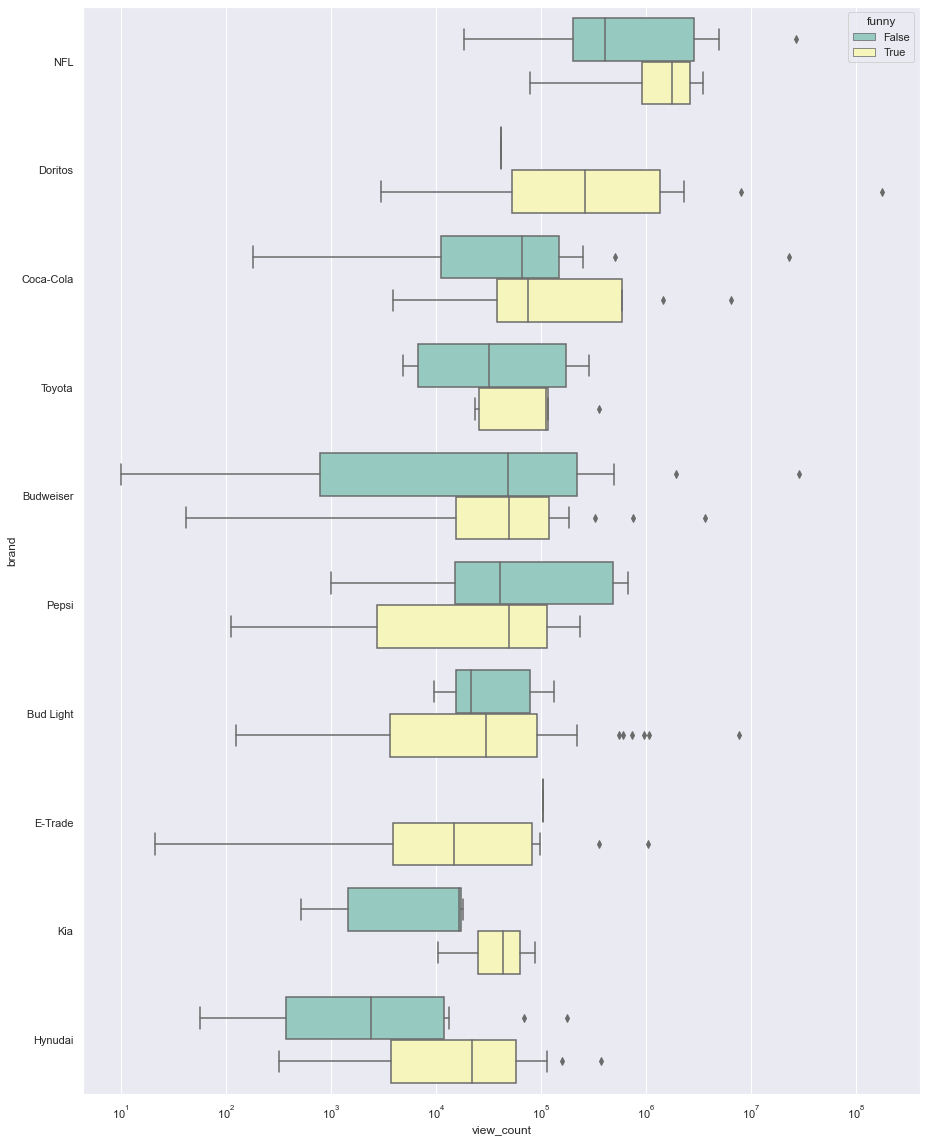
Now let’s see the effect of category of ads on viewership. we have 6 columns for 6 categories: funny show_product_quickly patriotic celebrity danger animals let’s boxplot them and look at the differences in their median.
import numpy as np
ads_categories = ads.loc[:,"funny":"use_sex"]

view_count_categories = {}
categories = ads.loc[:,"funny":"use_sex"].columns
for category in categories:
    view_count_categories[category] = ads.groupby([category]).view_count.sum()
view_count_categories = pd.DataFrame(view_count_categories).T.reset_index()
“funny” category
median of the viewship is almost always higher for the funny ads. this reminds me of jonah berger’s book “contagious”.
sns.set_style("darkgrid")
fig , ax = plt.subplots(figsize=(15,20))
ax.set_xscale('log')
order = ads.groupby(by=["brand"]).view_count.median().sort_values(ascending=False).index.values
_ = sns.boxplot(ax=ax, x="view_count", y="brand", hue="funny", data=ads, palette="Set3",order=order)
what sells more?
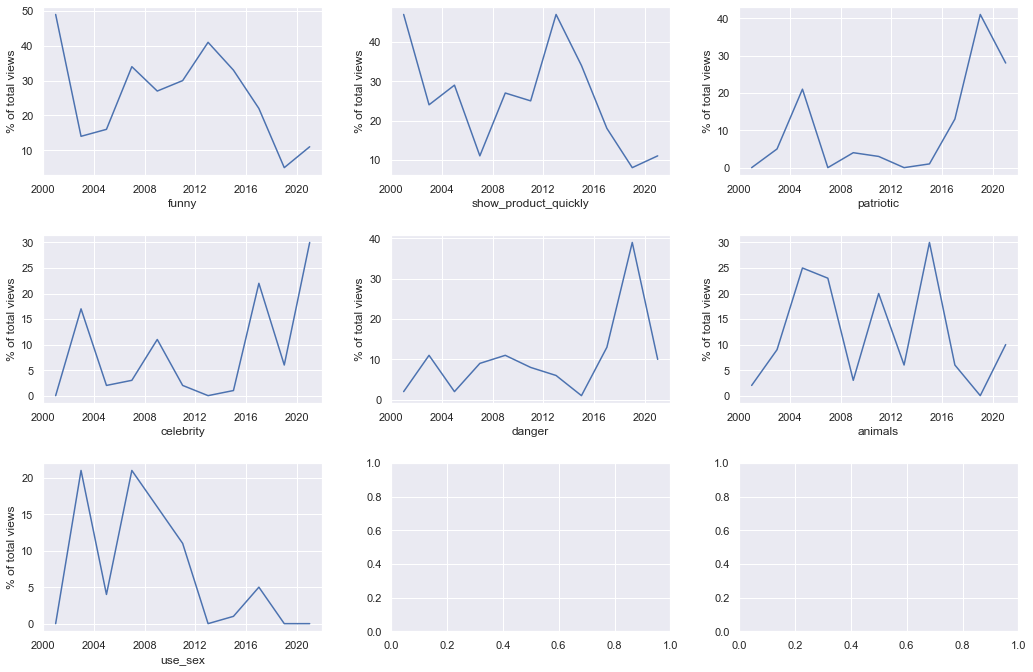
“patriotic” and “celebrity” have been on a rise, while “funny”, “show product”, “use_sex” have been all trending down.
category_year = pd.DataFrame()
for category in categories:
    category_year[category] = ads[ads[category] == True].groupby(["year"]).view_count.sum()

category_year.fillna(0,inplace=True)
category_year.index = pd.to_datetime(category_year.index,format='%Y')
category_year = category_year.resample("2Y").sum()
# category_year = category_year.rolling(3).sum()

category_year = category_year.apply(lambda row: row/row.sum(), axis=1).mul(100).round()
category_year = category_year.reset_index().rename({"index":"year"})
category_year = pd.melt(category_year, id_vars=['year'], value_vars=categories)
sns.set_style("darkgrid")
fig , axes = plt.subplots(3,3,figsize=(15,10))
fig.tight_layout(pad=3.0)

for i,ax in enumerate(axes.reshape(-1)):
    if i < len(categories) :
        cat = categories[i]
        sns.lineplot(data=category_year[category_year.variable == cat], x="year",y="value" ,ax=ax)
        ax.set_ylabel("% of total views")
        ax.set_xlabel(cat)
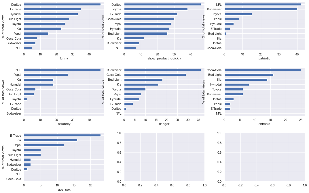
% of brands ads have this quality
I love this one:
- Doritos uses a lot of “funny”+”show_product_quickly”
- NFL is all “patriotic” and “celebrity”
- Budweiser has the highest % of “danger”
category_brand = pd.DataFrame()
for category in categories:
    category_brand[category] = ads[ads[category] == True].groupby(["brand"]).view_count.sum()

category_brand = category_brand.apply(lambda row: row/row.sum(), axis=1).mul(100).round()
category_brand.fillna(0,inplace=True)
category_brand
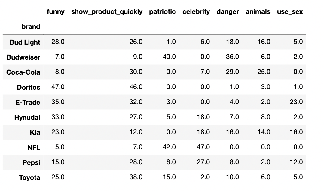
fig , axes = plt.subplots(3,3,figsize=(15,10))
fig.tight_layout(pad=3.0)

for i,ax in enumerate(axes.reshape(-1)):
    if i < len(categories) :
        cat = categories[i]
        category_brand[cat].sort_values().plot(kind="barh",ax=ax)
        ax.set_ylabel("% of total views")
        ax.set_xlabel(cat)
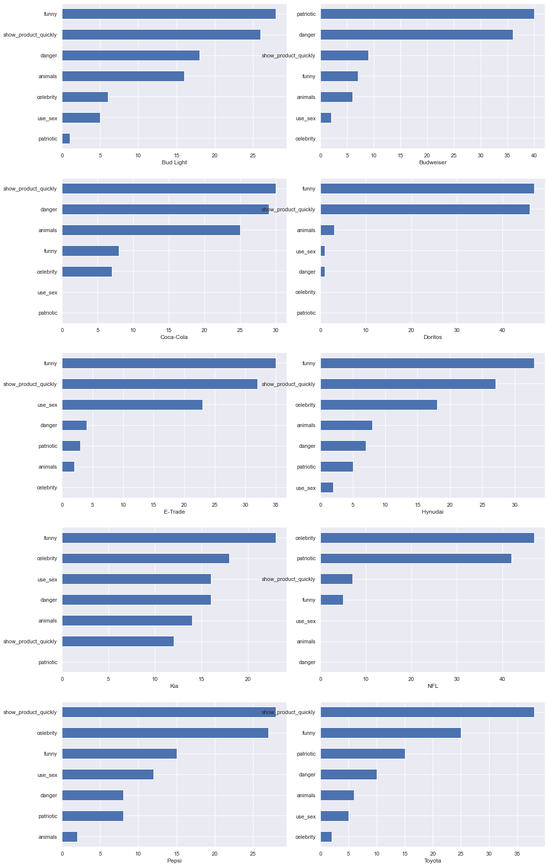
Fingerprint of ads for different brands
very nice way of seeing what each brand is about. in other words brand personality.
category_brand = category_brand.T

fig , axes = plt.subplots(5,2,figsize=(15,25))
fig.tight_layout(pad=3.0)

for i,ax in enumerate(axes.reshape(-1)):
    if i < len(category_brand.columns) :
        brand = category_brand.columns[i]
        category_brand[brand].sort_values().plot(kind="barh",ax=ax)
        ax.set_xlabel(brand)
Like/Dislike and polorizing ads
Checkout the like/dislike on this one from budwiser: https://www.youtube.com/watch?v=7ZmlRtpzwos
like_dislike = ads[["brand","year","title","description","view_count","like_count","dislike_count"]].copy()
like_dislike_total = like_dislike["dislike_count"] + like_dislike["like_count"]
like_dislike["dislike_ratio"] = round(like_dislike["dislike_count"] / (like_dislike_total),3).mul(100)
like_dislike.sort_values("dislike_ratio",ascending=False)
like_dislike_filtered = like_dislike[like_dislike_total > 1000]

sns.set_style("darkgrid")
sns.set(font_scale=1.3)
fig , ax = plt.subplots(figsize=(20,30))
ax.set_xscale('log')
sns.scatterplot(data=like_dislike_filtered,x="view_count",y="dislike_ratio",hue="brand",s=200,ax=ax)


# let's annotate it with titles
a = pd.concat({'x': like_dislike_filtered["view_count"],
               'y': like_dislike_filtered["dislike_ratio"],
               'val': like_dislike_filtered["title"] + " ("+like_dislike_filtered["brand"]+")" }, axis=1)
for i, point in a.iterrows():
    ax.text(point['x']+.1, point['y']+0.1, str(point['val']))


_ = plt.legend(bbox_to_anchor=(1.05, 1), loc=2,fontsize=15)
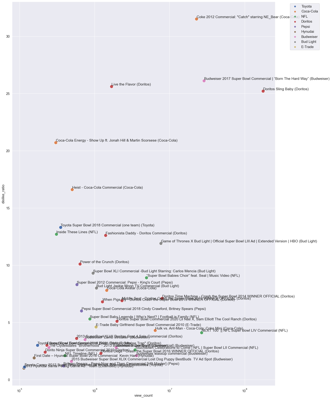
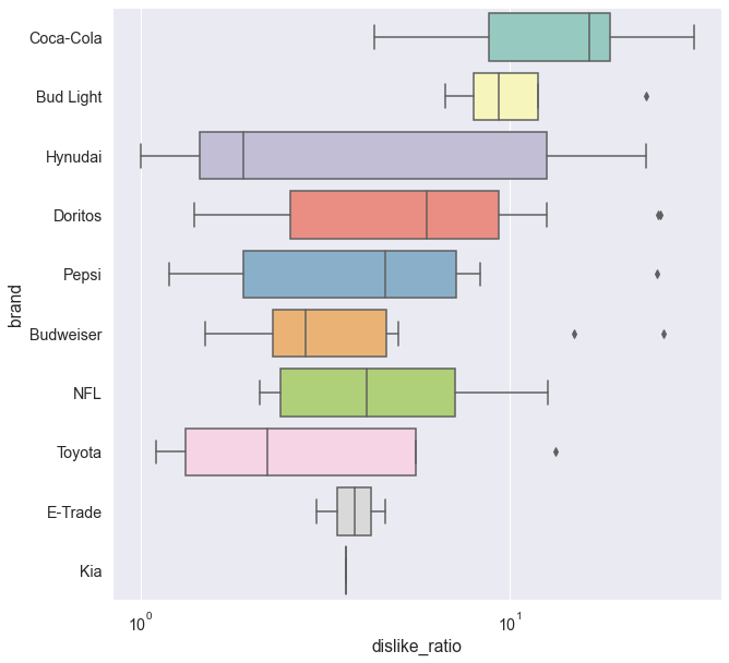
What brands tend to produce polarizing ads in terms of Youtube likes?
like_dislike_filtered = like_dislike[like_dislike_total > 500]

sns.set_style("darkgrid")
fig , ax = plt.subplots(figsize=(10,10))
ax.set_xscale('log')
order = like_dislike_filtered.groupby(by=["brand"]).dislike_ratio.mean().sort_values(ascending=False).index.values
sns.boxplot(ax=ax, x="dislike_ratio", y="brand", data=like_dislike_filtered, palette="Set3",order=order)
<AxesSubplot:xlabel='dislike_ratio', ylabel='brand'>