Simple skills sunday! We’re writing pandas queries.
I have a dataset of Walmart’s sales data from 2011 to 2016 in 3 tables.
-
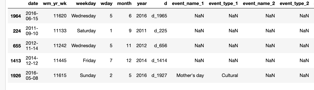
calendar.csv- a calendar for the period of the dataset. contains the events. -
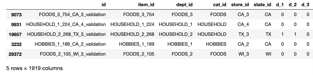
sales_train_validation.csvhistorical daily unit sales, per product and store -
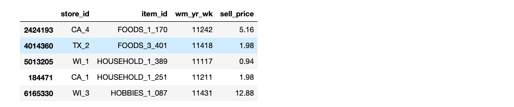
sell_prices.csv- a weekly mean of the prices of the products sold in stores
Let’s start by imports and loading the sales_train_validation.csv , sell_prices.csv,and calendar.csv
sales = pd.read_csv("dataset/sales_train_validation.csv")
price = pd.read_csv("dataset/sell_prices.csv")
calendar = pd.read_csv("dataset/calendar.csv")
Now that we have a sense of what our tables are, let’s start asking some questions and answer them one by one.
1. Sales trend comparison between states
states = ["WI","CA","TX"]
total_sales = pd.DataFrame()
for state in states:
    total_sales[state] = sales[sales["state_id"]==state].sum(axis=0)

total_sales.drop(total_sales.index[range(0,6)],axis=0,inplace=True)
We can plot the trends with a 25 day simple moving average( rolling(25).mean() )
sns.set()
total_sales.select_dtypes(object).astype(int)
total_sales_ma = total_sales.apply(lambda col:col.rolling(25).mean(),axis=0)
total_sales_ma.index = total_sales_ma.index.str.split("_").str[1]
total_sales_ma.plot(kind="line")
This is a good time for taking advantage of the calendar data frame. I replace d_1 to d_1941 with date. We can do it by merging on d column.
total_sales = pd.merge(total_sales,calendar.set_index("d")[["date"]],left_index=True,right_index=True,how="left")
total_sales.set_index("date",inplace=True)

sns.set()
fig, ax = plt.subplots(figsize=(10,5))
total_sales.select_dtypes(object).astype(int)
total_sales_ma = total_sales.apply(lambda col:col.rolling(25).mean(),axis=0)
total_sales_ma.plot(kind="line", ax=ax)
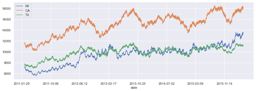
California sells more in total. Wisconsin and Texas are more stable than California. Seems like Wisconsin has been on the verge of surpassing Texas for a while, and it finally does. Now we should investigate the trend by looking into the sales trends per store in each state.
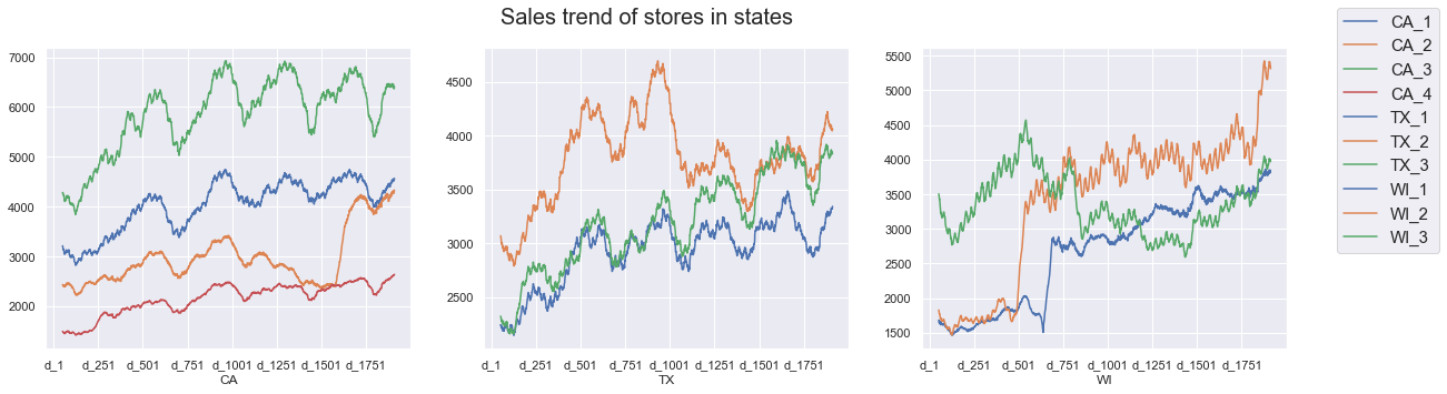
2. The sales trend comparison for stores in all states
groupby the sales data by state_id and store_id, and then transpose it. This gives us multilevel columns which we should get rid of. It makes things simpler.
sales_st_store = sales.groupby(["state_id","store_id"]).sum(axis=1).loc[:,"d_1":]
sales_st_store = sales_st_store.T
sales_st_store.columns = sales_st_store.columns.get_level_values(1)
Now let’s make a list of stores and states and plot the data for each of them.
states = sales["state_id"].unique().tolist()
stores = sales["store_id"].unique().tolist()

fig, axes  = plt.subplots(1,3,figsize=(20,5))
fig.suptitle("Sales trend of stores in states",fontsize=20)
for i, state in enumerate(states):
    ax = axes[i]
    ax.set_xlabel(state)
    for col in sales_st_store.columns:
        if state in col:
            sales_st_store[col].rolling(50).mean().plot(kind="line",ax=ax)

fig.legend(sales_st_store.columns.tolist(),fontsize=15)
3. Sales trend comparison within the categories of products
We need to find all the categories and then calculate the daily sales for each category over days.
catgs = sales["cat_id"].unique().tolist()
['HOBBIES', 'HOUSEHOLD', 'FOODS']
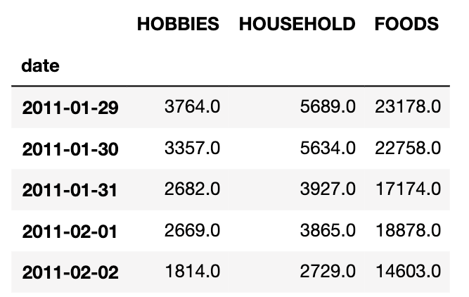
We’re iterating over the 3 categories and getting a daily sum of sales for each one of them. then we put everything in a new data frame, hist_sales.
hist_sales = pd.DataFrame()
for cat in catgs:
    cat_df = sales[sales["cat_id"]==cat]
    for day in days:
        hist_sales.loc[day,cat] = cat_df[day].sum()
hist_sales.head()
hist_sales = pd.merge(hist_sales,calendar.set_index("d")[["date"]],
											left_index=True,right_index=True,how="left")
hist_sales.set_index("date",inplace=True)
let’s plot it
sns.set()
fig, ax = plt.subplots(figsize=(10,5))
hist_sales.select_dtypes(object).astype(int)
hist_sales_ma = hist_sales.apply(lambda col:col.rolling(15).mean(),axis=0)
hist_sales_ma.plot(kind="line", ax=ax)
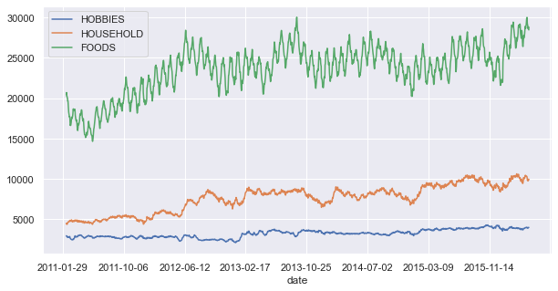
Foods category is generating most of the sales. it also has a seasonal trend which we obviously don’t see in Household and Hobbies.
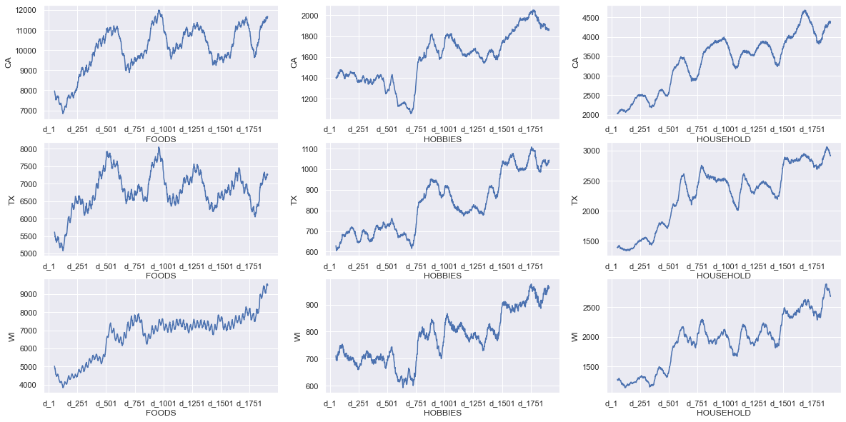
4. Sales trend of different categories in each state
Here I flatten the multi level column using join.
sales_cat_st = sales.groupby(["state_id","cat_id"]).sum(axis=1).T.loc["d_1":,:]
sales_cat_st.columns = ["_".join(c) for c in sales_cat_st.columns]
fig, axes  = plt.subplots(3,3,figsize=(20,10))
for i,state in enumerate(states):
    for j, col in enumerate(sales_cat_st.columns):
        if state in col:
            ax= axes[i][j%3]
            ax.set_ylabel(state)
            ax.set_xlabel(col.split("_")[1] )
            sales_cat_st[col].rolling(50).mean().plot(ax=ax)
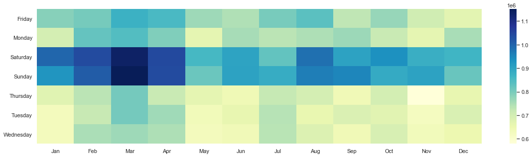
5. Total sales of Walmart over days of the week and months of the year
starting with the sales data frame, get a sum over days(axis=0). then get weekday and month from calendar and finally merge them together on axis=1.
days_sales = pd.DataFrame()
days_sales["sales"] = sales.sum()
days_sales = days_sales.loc["d_1":,:]

days = calendar.set_index("d")
year_sales = pd.DataFrame()
year_sales= pd.merge(days_sales,days[["weekday","month"]],right_index=True,left_index=True)
Now that we have them together we can groupby on month and weekday , and aggregate sales on each group. we also need to sort_values() weekdays, and translate months using a dictionary. The method for turning weekdays into Categorical before sorting them is a good one!
week_month = year_sales.groupby(["month","weekday"]).agg({"sales": "sum"}).unstack("weekday")

monthDict = {1:'Jan', 2:'Feb', 3:'Mar', 4:'Apr', 5:'May', 6:'Jun',
            7:'Jul', 8:'Aug', 9:'Sep', 10:'Oct', 11:'Nov', 12:'Dec'}
week_month.index = map(lambda m: monthDict[m],week_month.index.values)
week_month.columns = week_month.columns.get_level_values(1)
week_month = week_month.T
week_month.index = pd.Categorical(week_month.index,categories=["Monday","Tuesday","Wednesday","Thursday","Friday","Saturday","Sunday"],
                                  ordered=True)
week_month.sort_index()
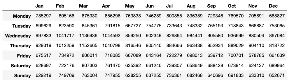
Now that we have everything in order, it’s time for a beautiful seaborn heatmap:
plt.subplots(figsize=(15,5))
sns.heatmap(week_month, annot=False, cmap="YlGnBu")
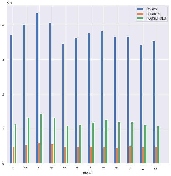
6. Aggregate sales of categories, monthly comparison and all time trend
cat_sales = sales.groupby(["cat_id"]).sum().T.loc["d_1":,:]
cat_sales  = pd.merge(cat_sales,days[["month"]],right_index=True,left_index=True)
cat_sales[cat_sales.select_dtypes(object).columns] = cat_sales.select_dtypes(object).astype(int)

cat_sum_sales_monthly = cat_sales.groupby(["month"]).sum()
cat_median_sales_monthly = cat_sales.groupby(["month"]).agg({
    "FOODS":"median",
    "HOBBIES":"median",
    "HOUSEHOLD":"median",
})
fig , ax = plt.subplots(1,figsize=(10,10))
cat_sum_sales_monthly.plot(kind="bar",ax=ax)
_ = ax.set_xticks(range(0,13))
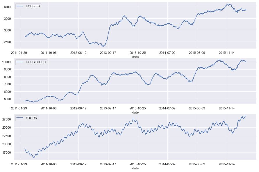
cat_sales = pd.merge(cat_sales,calendar.set_index("d")[["date"]],left_index=True,right_index=True,how="left")
cat_sales.set_index("date",inplace=True)

fig , axes = plt.subplots(3,1,figsize=(15,10))
for i,cat in enumerate(catgs):
    ax = axes[i]
    ax.set_xlabel(cat)
    cat_sales[cat].rolling(50).mean().plot(ax=ax,kind="line",label=cat)
    ax.legend([cat])
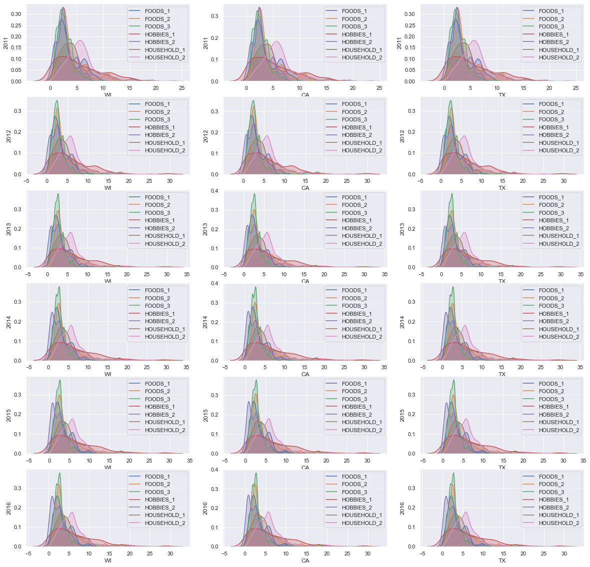
7. Distribution of yearly mean item prices in different categories
I would like to see if we can find any interesting changes in the mean of prices over time. Over each category and state. We need to merge and groupby sales, price and calendar.
Start by adding the wm_yr_wk and year to the prices.
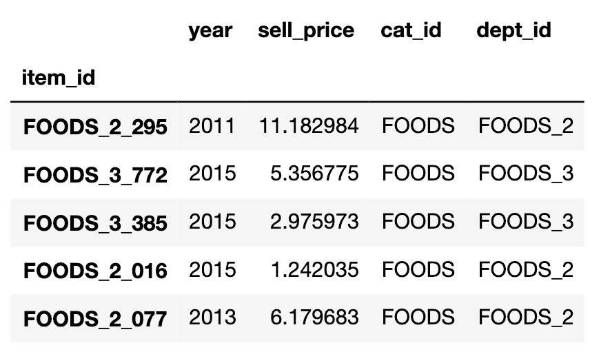
price_year = pd.merge(price,calendar[["wm_yr_wk","year"]],on="wm_yr_wk",how="left")
price_year_mean = price_year.groupby(["item_id","year"]).mean()
Then we can groupby and get a mean of the price of each item over the years.
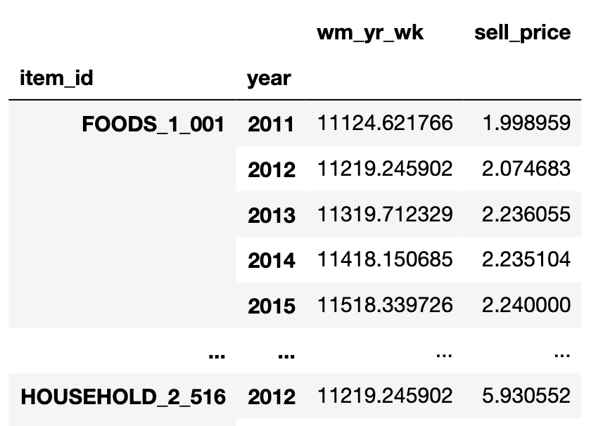
Drop the wm_yr_wk and move the year from index to a column. do the merge and then we can we can use kdeplot to visualize the distributions sharing the same axes.
price_year_mean = price_year_mean.drop("wm_yr_wk",axis=1)
price_year_mean.reset_index(1,inplace=True)
price_year_mean = price_year_mean.drop("wm_yr_wk",axis=1)
price_year_mean.reset_index(1,inplace=True)
price_dept = pd.merge(price_year_mean,sales.set_index("item_id")[["dept_id","store_id","state_id"]],on="item_id",how="left")
first I looked into mean prices for all departments in states, and the result is too messy to draw any conclusions from. but still if you look closely, you can see how the distributions of HOBBIES_2 and HOUSEHOLD_2 have been changing to a bimodal from 2011 to 2016.
We can make our figure more useful by drawing the same plots for categories, instead of states.
import matplotlib
catgs = ["FOODS","HOBBIES","HOUSEHOLD"]
fig , axes = plt.subplots(6,3,figsize=(20,20))
fig.tight_layout()

for y,year in enumerate(cat_year_price["year"].unique().tolist()):
    for i,cat in enumerate(catgs):
        ax = axes[y%6][i]
        cat_price = cat_year_price[(cat_year_price["cat_id"]==cat)&(price_dept["year"]==year)]
        for dept in cat_price["dept_id"].unique().tolist():
            plt.setp(ax, xlabel=cat)
            plt.setp(ax, ylabel=year)
            ax.set_xscale('log', base=10)
            ax.set_xlim(0.4,30)
            ax.set_xticks([0.5,1,2,5,10,25])
            ax.set_xticklabels(["$0.5","$1","$2","$5","$10","$25"])
            sns.kdeplot(cat_price[cat_price["dept_id"]==dept]["sell_price"],
                        ax=ax,shade=True,label=dept,legend=True)
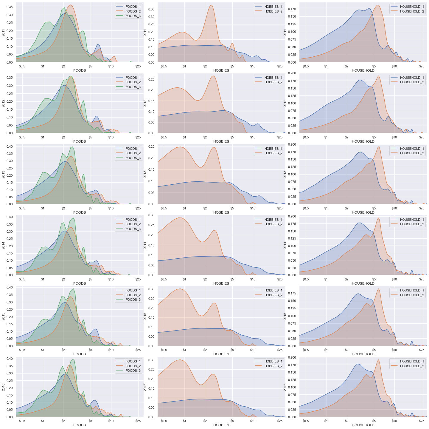
This one’s much better. Again take a look at HOBBIES_2 price distribution and how it’s changing over the years. it is centred around $3 in 2011, and is reforming to a bimodal and then slowly centering around $1.